While sounding strange at first, stylised realism is something a lot of companies use in both games, shows and movies to portray a certain method of style. Often, stylisation and realism are at opposite ends of the style spectrum which is a large factor in what makes stylised realism so appealing and unique.
What Is Stylised Realism?
It all stems from the idea of maintaining the original concept artist's stylistic interpretations of a character or scene, and creating the most detailed textures, realistic lighting and shaders available to create a truely believable world for the viewer to immerse themselves in.
Examples
An excellent first example of stylised realism is from Pixar, before Pixar was it's own company that is. The Adventures of Andre & Wally B from 1984 is one of the very first examples of the style. At only one minute and fourty seven seconds, The Graphics Group (as Pixar were known as back then) boasts two characters, Andre the human like character, and Wally B, the bee. The two characters are in a rendered forest which for the time is about as realistic as one could get through CGI.
 |
| Disneyplus.com. 1984. Watch The Adventures Of André & Wally B. | Full Movie | Disney+. [online] Available at: <https://www.disneyplus.com/movies/the-adventures-of-andr%C3%A9-wally-b/3NpHD7vwk2Ov> |
The lighting, shaders and textures of the forest and the character are all examples of early stylised realism, which for it's time is mind blowing.
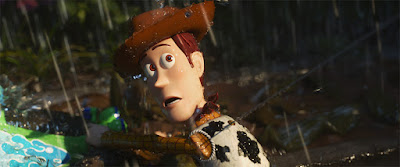
Pixar have gone on to master this techniques better than any other company in the film industry as evidenced by their newer release of Toy Story 4.
 |
IMDb. 2019. Toy Story 4 (2019) - Imdb. [online] Available at: <https://www.imdb.com/title/tt1979376/>
|
The lighting and attention to detail with the world around the characters is phenomenal, yet still keeping the characters stylised enough to avoid uncanny valley territory. 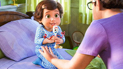 |
| IMDb. 2019. Toy Story 4 (2019) - Imdb. [online] Available at: <https://www.imdb.com/title/tt1979376/> |
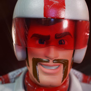
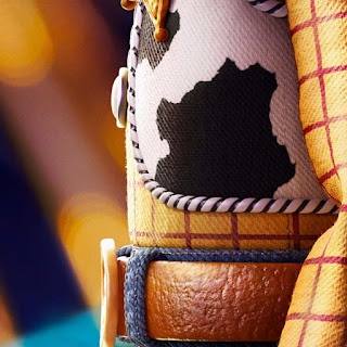
The toys and the humans are both as realistically rendered as they could possibly get without making them creepily human. This is done to avoid any unsettling imagery accidentally being produced in the films as they are primarily aimed at young children. The textures being rendered at such a high level of detail along with the stylistic shapes of the models and characters give the film this stylised realism appearance. For example, take the purple shirt that the man is wearing, compared to the first Toy Story which would have been a single block colour without the threads or the fibres is a huge step up, and is something that most stylised approaches to games or film don't bother to include. The hair is another fine example, as in most stylised things hair would be a single 3D mesh or even a part of the character itself as one object. In Toy Story 4 the hair is visible to each individual strand, making the style more prominent.
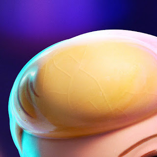
Below are more examples of the extent to which Pixar takes this style. The world of Toy Story is truely magical and mesmerising to a child, and Pixar's ability to push the boundries of realism with their works astounds people by the masses.
 |
Scratched, old plastic
|
 |
80s looking toy
|
 |
Small details on Woody
|
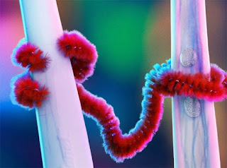 |
The fibres on a pipe cleaner
|
 |
The old pottery on Bow Peep
|
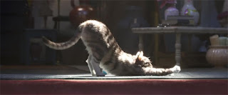 |
The hyper-realistic cat
|
Stylised Realism In Games
Unravel:
Unravel follows a character made of yarn named Yarny, through a highly detailed realistic looking world with a stylistic undertone. The player must use utilize Yarny's abilities to solve puzzles in unique ways, for example swinging across gaps using the very thing that holds him together, and pulling objects towards him by using himself as a lasso.
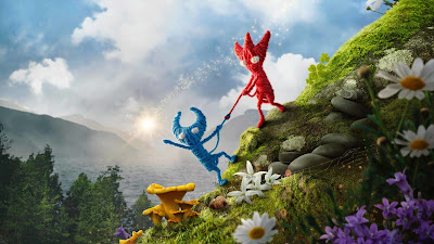 |
Unravel 2 (EA)
|
Unravel's game world is a wonderful mix of photorealism and stylisation, that leaves the player feeling as though they are venturing through one of Pixar's own films themselves, with the high poly meshes and photorealistic textures, it captures a style most games only hope to achieve.
Halo Infinite:
In a switch of styles, Halo Infinite takes the once realistic style of halo and adds a semi cartoonistic approach to the franchise.
 |
Halo Infinite (343)
|
In the images above, Brohammer (the pilot) is portrayed in a styled realism fashion along with Master Chief being the same way. The shape of the armour and colourisation is a lot softer and more stylistic than 343's previous two Halo games.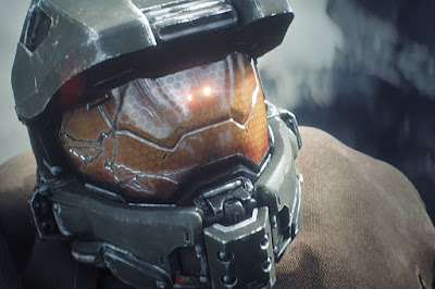 |
Halo 5: Guardians (343)
|
This image from Halo 5: Guardians demonstrates just how big of a leap in styles the company has taken from one game to the next, with 5 being heavily realistic with lifelike characters and renders in cutscenes.Illustrative Rendering:
This term has been coined by the developers of Team Fortress 2, a long standing class based shooter set in the 1960s. While stylised realism is not inherantly used in game, the concept art for the game demonstrates it well.
The concept artists for the game chose to create a unique silhouette for each of the nine playable classes, in order for players to distinguish the exact threat incoming even in the darkest areas of the map. The early concepts for the game are very remenicant of early war time posters and propoganda, with fine examples of stylised realism in play.
Team Fortress 2 Concept art (Valve)
The art from concept differs massively from in game, as the character models in game are no where near stylised realism, and are more cell shaded, cartoon renders. While the detail from the concept is missing, the key parts of the silhouette remain, allowing the characters to continue to be recognisable and icon amongst the gaming industry.


