Monday, August 23, 2021

The Conclusion

 This past year of study has taught me a lot about both my work and myself. Character design was always something I thought would be way above my skill level, and an unobtainable dream, until my Master's started. At the beginning of the year, I envisioned myself simply making a few stylistically rendered scenes with different themes, yet even while coming up with the idea I was minimally inspired, and somewhat instantly bored with the idea. Due to a lack of inspiration at the time however, I simply went along with the studies comparing stylistic modeling to realism modeling. That was until I tried to compare a skull from Rare's Sea Of Thieves by sculpting it in ZBrush. Even though I never added a realistic texture to the study, it instantaneously sparked a love of sculpting using the software, and since then I haven't been able to put it down. 

The skull sculpt is still something I am proud of looking back on as it resembles the in-game skull decently well, and was my first real ZBrush sculpt for this entire project. Initially, I sculpted this skull without the dynamic perspective setting on, which meant that when I imported the sculpt to Maya, the perspective was disproportionate to what I was seeing in ZBrush. This prompted me to learn about the software more before reattempting the sculpt, which in turn allowed me to go back and create a much cleaner, sharper and closer rendition of the in-game item.


The sculpt immediately after this is definitely what I see as the inspiration for the direction my work took, with the Sea Of Thieves pirate I made being my first leap into the character creation side of games design. This sculpt was such fun to make as it truly was a blind leap into the ZBrush software, in which I managed to pick up the techniques needed to create something that I was genuinely proud of. While the sculpt was stylistic in nature, it taught me a bunch of useful ways to use the tools inside the software, and what each brush is useful for. Looking back on the sculpt it could definitely use some improvements in a few areas, but overall it still remains a solid attempt for a first character sculpt.

The biggest thing that jumps out at me is the large number of polys used, as at this stage of the sculpt I was still working on it. While not exactly terrible, it's a lot harder to get a sculpt looking sharp and accurate if you're working with a super high level of polys at an early stage (from my experience at least).
I remember that while working on it, due to the high amount of polys, it was very difficult to maintain the sharp angular lines of the features, as any addition or subtraction of volume displaced the edges significantly.


After this pirate sculpt, I was 100% sold on the idea of learning and creating characters for the remaining Master's degree, with hopes of being able to create and rig full-bodied characters that could be seen as unique and interesting, while retaining my own unique style. To make this idea a reality, I had to of course delve into my own ideas for characters, and being a fan of westerns and old age cowboy media, I decided to create my next character as some kind of outlaw. While this idea worked, I noticed that while making the hair and accessories for the character, if I removed or added a certain hair or feature, the character could appear completely different, and so he went from an outlaw to an experiment where he resembled a bunch of different characters from different time periods.

With this character, for me at least, I can see a heavy influence from Sea Of Thieves' style of character design, especially around the nose and brow area. There are very clear areas of improvements to be made with this character looking back now, as I have further knowledge of the way the human head is formed and how it works which, even with stylisation is still important in order to obtain some believability to your character designs. The ears for one are much too flat and are also in the completely wrong shape both inside and out, the head is much too flat up top, and there are no muscles around the neck holding the head in place. Overlooking these things, however, the character is decently unique and holds its own style quite well, which is something I am still proud of for the little experience I had before working on it.

As mentioned above, this character was given a bunch of hairstyles and accessories to study how small features make a character's appearance change drastically, which I feel is evident in the two pictures of this one character, the bald one looking older and somewhat grittier, while the one with the longer hair appears to be more menacing looking, and somehow a touch younger than the hairless one. For whatever reason, I didn't include eyebrows on this character, which I feel could have been an interesting addition to the accessories and styles idea that I had been presenting. 
I also attempted another character following the same idea as this one straight after, with the idea being that the next character was to be sculpted with heroic imagery in mind, and see if the addition of accessories could make the character appear less friendly and more evil-looking, while maintaining a smile. 
As with the other character, I can see clear issues with the anatomy of the head, that would be basic knowledge for me going forward now. This character however I tried to steer away from the Sea Of Thieves influence, and attempted to branch into my own style. This becomes evident with the inclusion of the hair styles, that really bring a uniqueness to the character, differentiating him from the previous study.

Seen especially with the hair, I delved further into my own tests of style for this character, and felt that angular solid forms worked best for the type of imagery I wished to portray. This alongside the subtle colouring produced a uniqueness to the forms that resembled something similar to Hero Forge's character art. 

As previously mentioned, this test was to see how different accessories changed the idea of a character without providing any narrative behind it, which I feel this did rather well, presenting the same character with more of a villainous appearance rather than the generic hero type character. 

This experiment led to some rather interesting outcomes, the result of which ended on a battle scarred version of the original character, portraying someone who I feel could be some sort of minor boss battle in a game. 
The scarring came about by accident, when I enabled the colouring of polypaint along with the addition values of the standard brush. This led me to have a pinkish healed scar type colour for the addition side of the brush, with a deep reddish fresh wound look for the subtraction side. For stylistic approaches this became a great way to test wear and tear on the character, and create history for them with simple minor brush strokes. 


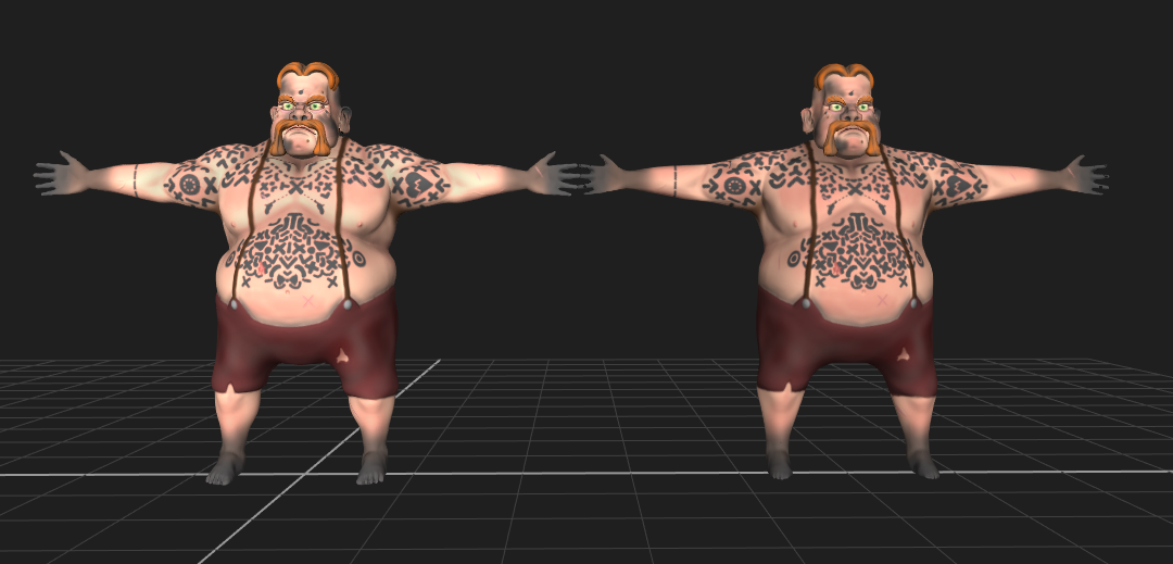
These characters then led me to try to find the sweet spot between stylistic and realism, with my next character. This one was meant to be as grotesque as I could get, while maintaining some semblance of a human being, which ended up being Duncan. Creating Duncan was a lot of fun, as I only gave myself a couple words as a prompt to see if I could come up with something to fit it. For this, I chose 'fat' and 'ugly', which, while being generic, provided an interesting result that helped me learn a lot about sculpting.
Right off the bat, the things that stick out to me looking back on this are once again the ears, I seemed to just completely ignore how an ear should look, and went with these flat crisp like things instead. However, the rest of the head isn't too bad anatomically wise. Clearly it's still very stylistic, yet the proportions of the head sit better than the last two character's did. A lot of this sculpt was experimentation for future reference, with noise being used for skin pores, wrinkling of the forehead, fleshy areas, fibermesh and material painting.
The main thing I took away from this sculpt was definitely the fibermesh, as I've used it quite a lot since. The different placement and lengths of this lot allowed me to learn the basics of the tool, and even some grooming for it as well. The material painting was also useful in this regard, however I have not since used it for anything else.


After Duncan being stylised realism, I wanted to delve into the realm of realism myself. This was something I outright jumped into without any knowledge of anatomy or facial structure, which while proved detrimental to this sculpt, would lay way to exciting things on my path of character art. For my first realism sculpt, I chose a character from the show Vikings which I was watching at the time, Ragnar Lothbrok. The reason this sculpt is so important to my journey through character art, is not the success of it, but rather the things that needed improvement. What I mean by this, is that once I presented it to the class, our tutor James Burton took it upon himself to give me help and tutoring through his own methods and techniques of character design, offering me insight into the best ways to sculpt for realism, and what sort of things need to be exaggerated for stylisation. James also enlightened me to the holy scripture of ZBrush realism, 'Anatomy For Sculptors', which goes in depth on the way the face works, what muscles sit where under the skin, and how they work with the underlying bone structure to produce the movements and creases we see in people's faces and bodies.
The sculpt itself was not terrible, yet had vast areas for improvement, in which James kindly walked me through and demonstrated using the ZTool itself.
He illustrated to me that I had dived into everything way too quickly  and enthusiastically, adding way too much detail before more vital steps were taken. With the huge beard, it's difficult to tell just how anatomically incorrect the character is, yet I feel it is the most visible within the brow and nose. The nose itself appears as one disconnected entity that has been grafted onto the face, rather than a natural part of it, while the brow is much too shallow, almost caved in.
Without the beard, it is a lot easier to see where I went wrong with the anatomy of the character, which is why it was so easy for James to help. For starters, the cranium is much too low, and the head itself is much too round. James demonstrated the changes I needed to make over a video call, by stretching the head and neck out to portray a more lifelike structure of bone under the skin. The detail was something else I had added much too early on, with the skin pored and scarring being something I should have added at the very final stages of production, after the character's form was full developed into a correct scaling. 

While this sculpt wasn't as successful as I'd have hoped, it opened the door to the next vital step into character design, and got me the assistance I didn't know that I needed to move forward in the medium. 
Using the Anatomy For Sculptors book, and James' feedback, I went into my next sculpt with a lot of optimism and excitement and studied the book religiously alongside sculpting, with one screen being a PDF of the book, and the other being ZBrush so that I could comparatively learn while I worked. This proved to instantly improve my work, comparatively with the Ragnar sculpt the anatomy is so much better and stronger with the structure behind it. James also critiqued the newer sculpts after I had completed them and offered insight on how to improve them further, which I took extremely seriously and got straight on to work on the next one to implement what I had been told. This method of work flow helped me to improve my sculpts drastically, in both the realism anatomy sculpts and the stylistic studies, as I was also being taught better methods for production and sculpting as well as better anatomy for the sculpts themselves. 


A large critique of the first anatomy study was that the bone structure seemed a little 'caved in' and shallow, which I agreed with, and so went on to try a second character. At the time, I felt very strongly about this character being realistic, however, once James went through it with me, he provided some very helpful insight and critique that allowed me to look at the sculpt in a different light. James' critiques for this sculpt were that I had dived into the final detailing much too early into the production of the head, with the skin pores and wrinkles looking 'muddy' which could have been improved with proper building up of fleshy volumes rather than carving the wrinkles into the head with a single dam standard brush. Another critique was that the shape of the skull was a little shallow still, with the top of the head being on the low side, which I can see, as the eyes need to be roughly in the middle of the head. James also mentioned that my sculpts would benefit more if I 'dug in' more with the mouth, as with this study and the last, they appear sculpted on the top rather than part of the head, without the illusion of it being usable.
My third anatomy sculpt taught me the most out of the three, as I managed to get the head shape relatively close to how a human head should look. This time, I also stopped at this stage to send to James so that I wasn't jumping ahead with detail, and that my next step was the right one to take. To create this character, I went into Red Dead Redemption 2 and used John Marston as a reference character from all angles to build a base, and then once the study resembled a character with decent enough proportions, I strayed away from the references to create something of my own. One thing I noticed looking back is that the ears are a bit too elf-like for a human anatomy study, with the inner part being a touch too thick. This study left the character a little too uniform and symmetrical with its features, which James told me to break up with volumes of fat to displace the symmetry as the next step of this study.  
The next step of this study took two different directions, as I decided to add a little bit of the initial idea of comparison between stylisation and realism. This stylistic approach was done with a Dishonored type study in mind, as the way they portray their stylistic realism is heavily inspirational to the way I wished to portray this character. To add my own style to it, I made the volumes more angular and sharp in places, with the symmetry break being largely exaggerated, especially around the nose. This was also a study in expression, as the disgusted look required me to wrinkle the character using the fat volumes in a precise manner to look like it was pushing the skin. A critique I'd give myself for this study would be to dig deeper with the definition of the teeth, as they appear somewhat forward and almost appear connected to the lips themselves. Filling the face out with the volumes also made the character appear older, and less gaunt than they were with the initial starting point. One thing I noticed with this style of sculpting was that deep looking scars just kind of fell into place while I was adding the various tissue sections, which gave the character some history in a sense.
On the more realistic side, the fatty volumes I added in this section were larger and softer, giving the face a fleshier, more lifelike appearance. The areas I feel that this was the most successful is around the chin and cheeks, as they to me at least look fleshy and soft as opposed to the harsher more solid forms of the stylistic approach and the base study that this one grew from. These two studies on top of the anatomy study have proved exponentially useful going forward, as not only have they taught me more techniques with the way I sculpt, I have learned so much more about the way a face needs to look in order to become somewhat believable. A self-critique I have for this render is that the wrinkles on the forehead still seem carved in instead of sitting naturally, which I feel could have been heavily improved with the addition of more volume between where the wrinkles dig in, causing the folds to sit more naturally on the head and coinciding with the other wrinkles made with the fatty tissue in other areas of the head. 
The side profile is the downfall of this study, as the neck placement concerning the skull is quite badly off. The head should be sat comfortably on top of the neck, with the neck supporting the weight of the skull rather than it being an extension of the neck towards the back of the head. While the front of the face is okay, the ear is pushed way too far back, which in turn brings the jawline too far as well. The jawline is also angled too harshly from James' observations, making the entire side profile seem strange and out of place. The nasolabial folds (the lines from the side of the nose to the corner of the mouth), also appear too shallow, they should protrude out more towards the top and curve in at a more slight angle than it is on my sculpt at the bottom.

The next thing I decided to sculpt was Monstro from the game The Binding Of Isaac. This was my first ever 'speed sculpt' with it taking roughly two hours from start to finish including the polypaint. This experiment was a simple study to both make sure I was in practice with stylisation still, and that I could accurately recreate something in 3D from a 2D design. This sculpt was extremely simple, and so was done in a very short amount of time, allowing me to learn a little more about the addition of subtools for creating a character, and then allowing me to move on to something more substantial going forward.
Due to the way I started my character art journey, I wanted to honour Sea Of Thieves again now that my skills had somewhat progressed to a more stable point. For this, I created my in-game pet monkey, Frank, trying to maintain an accurate representation of the style of the game while doing so. This again took very little time but was an excellent study on the replication of characters for inspiration or fan art purposes. A critique I can give myself for this would be that the mane of the monkey appears a bit too soft, and would benefit from harsher, sharper lines and surfaces, especially where I have dug in to separate the tufts of fur. Another critique would be the mouth and nose are a bit shallow, and could be dug in a bit more to illustrate the fact that this character holds to form, and is not just a statue of the creature. 
Playing around one day, I decided to try and see what sort of things I could create from a previous sculpt. For this, I chose to create an undead version of my third anatomy study, using the techniques for detailing that James had taught me. This experiment allowed me to get a better picture of my own work, as turning the character into a rotten version of itself required me to visualise the skull that sat underneath the skin, and how the skin would sit should the character be rotting away. While this was just a bit of fun playing around with finished work, it did teach me some important things, such as the way the gums would sit in the mouth for a character so that it could hold teeth in place. I also figured out the technique that is currently in place on the eyes of the character that I now use when blocking a new sculpt in, a simple circular form in place of the iris of the eye, smoothed out a touch can create a nice form to get an idea of how the character will look.
One of my favourite experiments of the second semester was the cow. This idea came from a friend of mine who requested I sculpted him a cow, and so I figured it would be a great opportunity to try some experimentation with the way I create characters. The experiment being if I could create a character that could seamlessly fit in with another game's style, even though that thing isn't inherently from that game's universe. For this, I again chose Sea Of Thieves, as they include livestock such as pigs and chickens, but no cows. This study was excellent fun as I ended up using real images of cows, cartoon drawings of cows, and both the chicken and pig from Sea Of Thieves to capture the style I wanted to achieve. The angular edges of the nose, eyes, and ears are all prevalent in the character design of the game, and so I feel this rendition of a cow could sit comfortably within the universe. 
One of my more interesting studies, the superhero was the second time I had chosen to try stylised realism. While this character is clearly leaning more towards the stylistic side of things, the anatomy behind the character was something I spent a long time perfecting, in the same sort of way a comic book doesn't exaggerate the proportions of their characters too much. As well as an exercise in anatomy, it was also an exercise in facial expression, as I felt that conveying emotion with nothing but the eyes would be an interesting task. This required me to look into how Marvel portrays  emotions through masked characters such as Spider-Man and Deadpool, with very subtle emphasis on the nose and mouth area, and heavy expression through the eyes of the masks. One of the most fun aspects of this sculpt was trying to get the anatomy of the facial features such as the nose and mouth correct without actually having them visible, the way I combated this was by sculpting rough forms of the nose and mouth, and then flattening them down and sculpting over them to create the illusion that they are slightly squashed behind a mask.
This sculpt was also where I feel I got the head and neck in a much better position and build than the previous anatomy studies, as the proportions look to sit well with the idea of a human head sitting under the mask. I also corrected my issue with the top section of the jawline that James' critiqued me on for the last study, which I feel brought the character to life a little more. One issue I have with this character is the lower half of the bust, the torso. Had I preformed a few studies prior to this sculpt, I definitely feel as though I could have achieved a better look for it, yet at the time I was to focused on the anatomy of the head rather than the overall anatomy of what a full bust should look like.
Perhaps my quickest anatomy study yet was a stylised realism rendition of Glenn Rhee from The Walking Dead. The style I wished to portray was a mixture of the comic book, TellTale's game, and the show's actor Steven Yeun. This study was done for two reasons, the first being that I could successfully create a character in a shorter amount of time to the same standard that I had previously been aiming for, and secondly by trying to create a different look for my studies, as James mentioned how the initial three anatomy sculpts appeared to be renditions of the same references, which was true, as they were all made using the same key points in the Anatomy For Sculptors book. This prompted me to study a different ethnicity for my next character, which was a great experience that taught me a lot about the differences in facial features and how and why they exist.
This sculpt was also the first time I had created the mouth of the character by starting with a large chasm, and closing it using the pinch tool before sculpting lips onto it. This gave the mouth a much greater depth, and really gave the feel that the character could open it and talk at any moment. While I haven't used it for a render since, I also learned how to add an outline to the sculpts in ZBrush, as a nod to TellTales signature style with their games.
The next big leap I took was full body character creation. This series of three outlaws taught me a lot about anatomy, clothing, rendering and how to properly export things out of ZBrush ready for use in other software. This first character, Goldtooth McGee was designed in mind to be a gross looking old bandit that cared very little for his own health and appearance. This also being the first lot of characters I had created with a vision in mind for who the characters were, rather than a recreation or a study. For the first full body, I can see areas where the character could be improved, such as the length and width of the torso, which I believe to be too short and thin, even for the style and the malnourished look I was going for. The hands were also a huge challenge as I'd never even attempted to create some before. This required me to do a hand study to make sure I could capture the form in a stylistic way, that also worked somewhat accurately.
The second character was where I really feel like I captured my own style. It enabled me to fully show exactly how I had envisioned the character in my mind, which I feel is a success for what I am trying to achieve. Explosive Eddie's build required me to look into the muscular structure of biceps, chest, and back in order to accurately portray the character's form in a believable manner. The clothing on this character I feel fell short, but the anatomy knowledge I gained from the creation of the character was a worthy trade off. With this character also came the development process blog, which documented step by step how I created the character from start to finish.
The third and final character in the series of outlaws is Deadeye Daniel, a character which I wanted to make extremely unique with the lack of eyes and arms. While I didn't necessarily learn any new techniques while making this character, I feel the anatomy and the clothing came together a lot better than the other two characters. The polypaint I also feel turned out a lot better than the other two characters, with the shading and grime fitting in well with the overall appearance of the character. These characters were very fun to envision and create, but I wanted to also push myself into realism more as well, as it benefits not only realism aspects but they stylistic aspects too, with knowledge of anatomy being applicable to both areas. Originally, my plan was to create these three outlaws alongside three lawmen, however I felt six characters in the same style may get a bit bland, and so opted to try and different approach to the final piece which would be an actual realism sculpt, the first one that isn't a study.
These characters stemmed from a collaboration with fellow student Niall Platt, who's museum holds photogrammetry scans and models of a bunch of interesting things from both history and fiction. The Spongebob characters fit in with the museum, as Niall has combined photogrammetry with modeling to recreate the character's houses. The idea behind the characters was to make them appear grotesque and hideous, with Patrick being a prime example, as him being a larger character, I could exaggerate that to the benefit of the brief Niall asked of me. Using this, I filled the face with multiple deposits of fat to exaggerate the horrific appearance needed. The veins were added around his body simply to make him that much worse looking. The shorts of the character I feel worked strongly, as it fits the style of the character while retaining some believability that they are fabric.
The Spongebob character I feel was the weakest of the three, especially with the eyes. Niall was happy with the result however I felt as though it could have turned out better. The body and clothing however I am decently pleased with the outcome. It was during the creation of the Spongebob character however that I learned about the decimation master tool, which allows me to divide the polys of a mesh into a much smaller amount, making it much easier for retopology and easier on engines to handle in game. Decimation master has been used going back on the outlaw characters ready for their retopology, allowing Maya to run smoother and faster, letting me work more efficiently. Had I not had my own projects, I would have returned to this sculpt to have another go at the features I feel fell short, such as the eyes and nose.
Squidward was the last character in the series, and turned out rather well alongside Patrick. Maintaining the same style while trying to replicate an already existing character was fun to do so, and while I did the same with the outlaw characters, this series felt different as I had to intentionally make them disgusting looking while keeping them close to their original design. Squidward was the quickest to be completed out of the three, taking only a few hours in total from start to finish. Which enabled me to move on to my own big project with ease. One thing I think fell short with this character was the shirt, as I feel it doesn't sit naturally where it begins to crease, and the arms of the shirt appear a little too blown up as well. Aside from this, I am happy with the outcome of this character, and Niall is too. Currently, all three characters have been placed inside Niall's museum, and can be picked up and inspected like a collectable.
Arthur Morgan is one of my all-time favourite characters from any form of media to date, the earlier anatomy sculpts all took inspiration from his features too, so I was almost certain that I had to do a bust of him. The character itself took roughly a week to capture the likeness of his facial structure, and slowly add the detail where necessary. The clothing took less time as that was not the main focal point, yet I still tried to include detail where I could. This sculpt is easily my favourite out of the ones I have produced, as I feel I have captured the likeness well. From this sculpt I have learnt many things, the detailing of the skin, the ability to add accessories, and even learning how to create a hairstyle using fibermesh. Each section of Arthur's hair was added separately and moulded into shape using the move tool. Once the section looked how I wanted it to, I moved onto the next and combined them once the hair was finished. I chose to give the bust a stone-like appearance, as I believed that my polypainting skills were not as advanced as I have liked them to be for realism painting. This led me to keep it in white, which when I changed the material to FastShader, reminded me of a stone bust, which prompted me to turn it into such.
The next step for the outlaw characters was the retopologise and bake the detail onto a lower poly model ready for placing into a game engine. On the left, the model sits at around 500k tris, while on the right, it sits at roughly 10k tris. The baking process allows for the smaller details of a mesh like the creases of the clothes and notches on the belt loop to be turned into normal map data rather than physical points on the mesh. This is much less tasking on software like Maya and Unreal, and allows for many more things to be added at once. Retopolgy is also an important part of the character design process as it a allows for the flow of the faces of a mesh to meet with the directions that the character's body parts can move, for example, around the eyes need to be circular in order to enable a larger range of fluid motions while maintaining the integrity of the mesh. It also benefits the UV maps, as the areas are more visible to the artist that is texturing the character.
Rigging was an interesting process, that came with a number of things for me to learn. For these characters, as I modeled them all in a T pose for rigging, I followed along with a tutorial that showed me how to use the automatic IK rig. While effective, this presented it's own problems in the form of skin weighting. The characters lacked weight with their rigs, so if a large movement was made to the character, deformation would take place in the area surrounding the movement. This was combated by skin weights, which stop certain sections of the mesh from being pulled or pushed along with the rig, stopping the stretching and pulling of unwanted sections of the mesh.
My final study was the most difficult I have undertaken so far, a self portrait. While a very fun challenge, the sculpt itself was extremely difficult to get right, as I constantly questioned myself with my own appearance throughout, confident that I looked one way when in fact I didn't and vice versa. The biggest challenge I found for this was the eyes and brow, as nothing I did stuck me as looking like myself. Originally this was going to be my final piece, yet turned into a more interesting study on the perception of self image, alongside the importance of proper lighting for reference. What I mean by this is, the volumes of fat around my face appeared different in almost every reference picture I took, this was due to the different lighting around my room at the time, and using a low quality webcam to take them. Going forward, I have learned a fair bit from this, as I have been paying extremely close attention to the structure of my face since doing so. I wish to return to this project eventually once my skills have progressed much further, and see if the task is as difficult then as it is now.


Overall I feel this journey has been an amazing experience into the world of character design, and I can't wait to delve further into it and expand my knowledge and skill base. There isn't a single part of the process that I haven't found fascinating or fun. Developing this skill set has been one of the funnest parts of games design course experience, and I hope to continue what I'm doing. I definitely feel as though there is still room for improvements with my sculpts, especially when it comes to detail, as there are sections of my work that aren't as polished as others.

Saturday, August 21, 2021

Finished Tom

 I've finally reached a point where I can't get any closer to my own face, so I have decided to wrap up the sculpt with a bit of skin texturing to bring it together. I have chosen not to add hair, as I am regarding this as more of a final study rather than a final piece, with the Arthur sculpt being my main final piece.

Here I have broken the symmetry of the sculpt to get as close to my face as I can, which I feel somewhat happy with. I feel as though this is something I can come back to in the future in order to get a better, more accurate render of myself once my skills are improved. This likeness study allowed me to properly examine the finer details of the human face, yet also taught me that properly lit reference imagery can help a lot more than simply using different angles.
One of my biggest critiques I can find is that this sculpt feels like a more aged version of myself rather than my current self. This I feel could be down to the volumes of fat and their placements around the face, specifically the brow.

Friday, August 20, 2021

Tom Sculpting

 After many hours of sculpting I believe I have gotten to a point where I can't get any closer to creating my own face. I think that while close, the sculpt is a little off being a replica of myself, but I believe that if I were to return to the idea further down my journey as my skills improve that I will be able to get much closer.

The brow and eyes were something I struggled a lot with to get close to mine, I spent a few hours going back and forth making sure I could at least get somewhat close. For this sculpt, I have avoided adding hair and skin detail, and even breaking symmetry as I believe that this ended as more of a study rather than a final piece.

The topology of the sculpt was very stretched near the eyelids too which didn't help much with capturing the shape I needed. I tried to fix this by dynameshing the mesh, which DID work, however working on the sculpt after that was difficult as the mesh was too smooth, and there were no subdivision levels to bounce back onto to graft in detail where I needed. Because of this, I ended up undoing a good 2 hours worth of work so that I could get back to a comfortable point that worked better for the stage I was at.

Another thing I constantly found myself doing was reshaping the entirety of the head and jawline, as every time I shaped it, it didn't look right.

I feel like the similarities are there, however I need to better my skills before I attempt something as complex as a self portray again, as the sculpt is more of an aged / uncanny valley version of myself.
 

Another aspect of my face that I struggled with was my cheeks, as from some angles they appear round and fat but from the front they are more gaunt, which I found extremely difficult to translate over to the sculpt itself. The smile lines going from my nose to the corner of my mouth on the sculpt constantly appears deeper than it should, no matter what different techniques I try to get it looking more subtle. Another issue I found was that the lighting in my room constantly made the volumes of fat around my face appear different with each angle I took a picture, including when I went into the bathroom with a mirror in that also had completely different lighting, which in turn made me look even more different.

Tuesday, August 17, 2021

A Large Task

For the final project of this semester, I plan on sculpting my own face. I feel like this would be a fun exercise as I can have a constant reference in front of me by using a camera. I feel it will be difficult to achieve a good likeness however, as everyone perceives themselves differently to how others do, meaning I will have to focus extra hard on the tiny details of my face that I wouldn't usually notice when looking in a mirror. I also want to carry out this project as I think it would be fun to have a model of my own face that I could manipulate with different hair styles, scars, clothing etc to put myself in all sorts of different scenarios which I wouldn't normally be able to see. As with the Arthur Morgan sculpt, I plan to keep myself unpainted as I need to study more into the realism side of character painting before I feel comfortable painting a realism sculpt for a final piece. However, the studies I intend to carry out will be done so using both Arthur and myself as a base for learning the painting techniques.

Monday, August 16, 2021

Squidward

 The third and final character made in the collaboration between Niall Platt and I is Spongebob and Patrick's neighbour, Squidward Tentacles.

This character fits better with the style of the Patrick one, as I wasn't too happy with how Spongbob turned out initially, however once in Niall's museum, it fit rather well. This Squidward sculpt appears similar to how the grotesque closeups look in the show, which is something I wished to achieve with all of the characters.

Adding the grosser details like the lumps and veins was fun, as it really brought the idea of a 'cursed' squidward together.


Wednesday, August 11, 2021

Weighted Painting

 After a lot of trial and error, I have seemingly figured out how to paint weights on the mesh so that distortion is at the very least limited to a small amount. Painting weights onto a rigged character's skin allows for the character to be controlled with the rig, without deforming the areas of the mesh surrounding that particular joint. This allows for a more realistic and natural look with movement and posing.

This tool allows me to select each joint, and paint the region of movement that should be available for that area. With this rig however, I have had trouble with the skeleton being slightly off with the hands, and can't seem to figure out a fix to get them truly centred.


Second Character Retopped And Rigged!

 After the success of the first character, the second character retopology took a lot less time, and the rigging also came a low quicker. This time the character sits at a nice 16k polys, with it's higher poly version sitting at 1.5 million polys. This drastic drop has allowed for the character to maintain the detail I included with the sculpt using baking, while maintaining a nice and easy set of polys to work with for rigging, and for ease on my computer's power.

A difference I noticed with the retopology for this character, was that I didn't include enough polys on the shoulders, which led to the arms being slightly thinner that it's original model.

I feel as though I have improved the edge flow for the retopology since my previous character, as this one seems to contour more to the positioning and flow of his body.


Tuesday, August 10, 2021

Some Simple Rigging

 As a small test I decided to see what the basic IK rig would do when automatically added to my character, and the results were surprisingly good. The rig works as expected with joints all placed in the right parts of the character, allowing for movement in most areas. One big issue is that there is no blend weights, meaning that on some joints such as the the neck, the character will deform when that body part moves. This can be prevented with blend weights, which will be the net thing for me to learn in this finalization part of character creation.

The working IK rig on Daniel.

Stretching and deformities seen due to a lack of blend weights.


Success

 After retopologising the head, I found that the rest of character was really easy to understand the flow of the polys that I needed. Also the baking of the normals has been something that has always seemed daunting to me as I've never really understood the process. However, once I got started with it and saw the results, it felt a lot easier to bake each part.

This seems like a much stronger bake than I had for the head, and has picked up every detail of the character very well.

The difference between the two models visually is very minuscule, which I feel makes the retopology a success, however I feel like I made the bones on the character's arm sockets a little too low poly, however not by too much to be noticable.

As seen on the wireframe, the difference in polys is huge, the original character on the left sits at 287k tris, while the retopologised and baked character on the right sits at 8.5k tris. I do feel as though I could have gone quite a bit higher with the polys on the retopped version to allow for a few smaller details to really be visible.


Monday, August 9, 2021

The Joys Of Retopology

 Today I have been learning and applying retopology to my character Deadeye Daniel from the stylised full bodied outlaw series. This work has proven to be, as I thought, very time consuming and tedious, however it helps to significantly reduce the polys used when making a character. I am also learning how to transfer the polypaint to the retopologised model via the Transfer Attributes tool.

So far the retopologising has gone well, though I feel I need to practice my edge flow for the faces were I to eventually take my characters into some form of animation. 
The edge flow around the eyes and mouth often needs to be circular to allow for opening and closing, and for the range of movements that both parts of the face are capable of. 

For the first try at retop and bake I'm fairly happy with the results, going from 116k tries on the high poly head sculpt to 3240 on the low poly. One thing I have noticed however is that the seams of the UV seem very noticable after baking, and in some places the texture itself needs a little bit of fixing, as there aren't enough polys to hold the forms together enough on the UV map. This can be rectified with either more polys being added, or a simple feathering background of the block colours in photoshop.


The Conclusion

 This past year of study has taught me a lot about both my work and myself. Character design was always something I thought would be way abo...